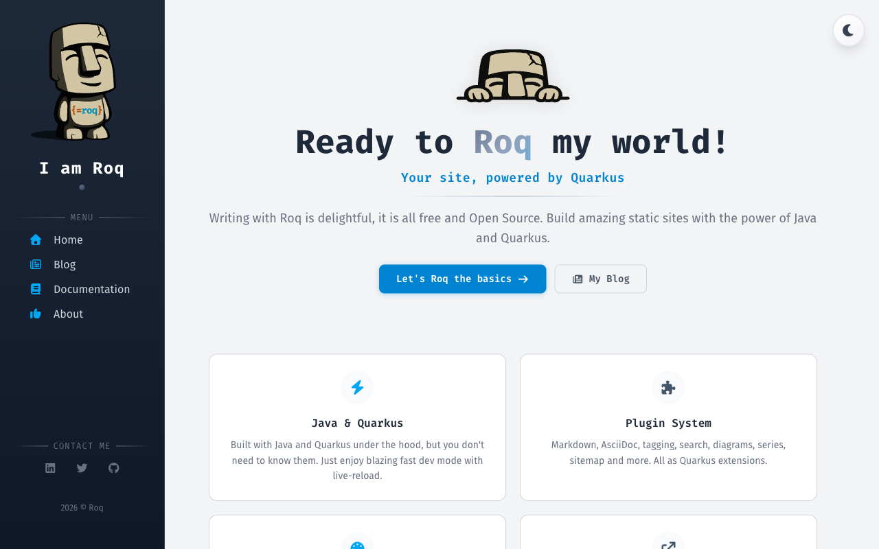
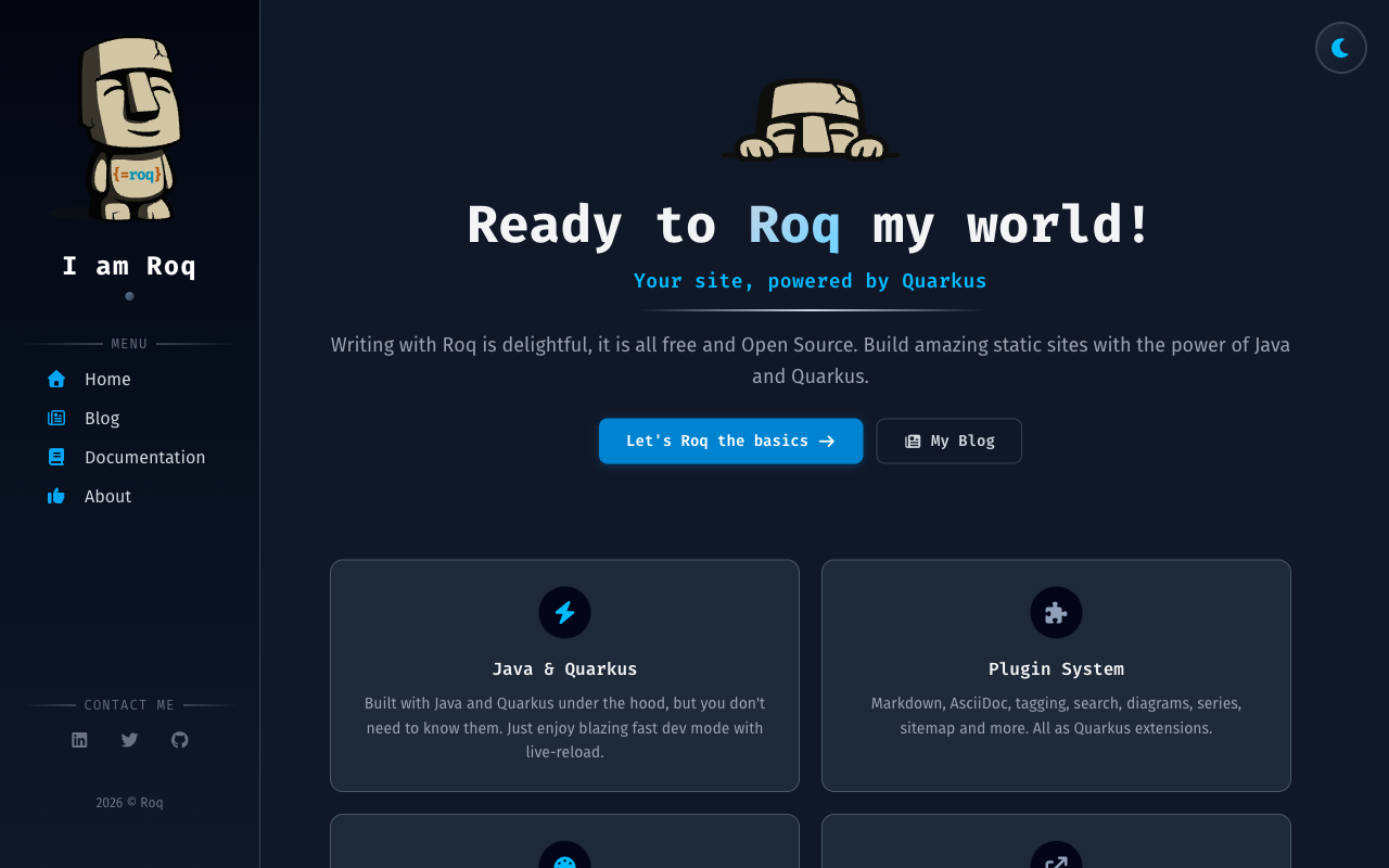
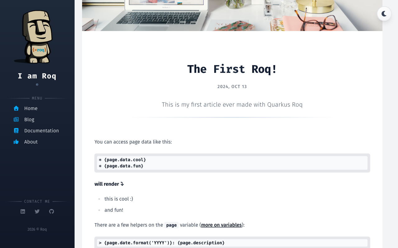
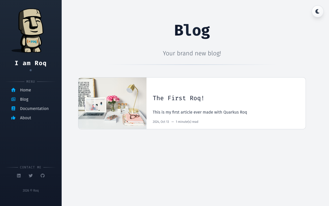
Default Theme
The default Roq theme for blogs and sites, built with Tailwind CSS, featuring dark mode, responsive design, sidebar navigation, and social media links.
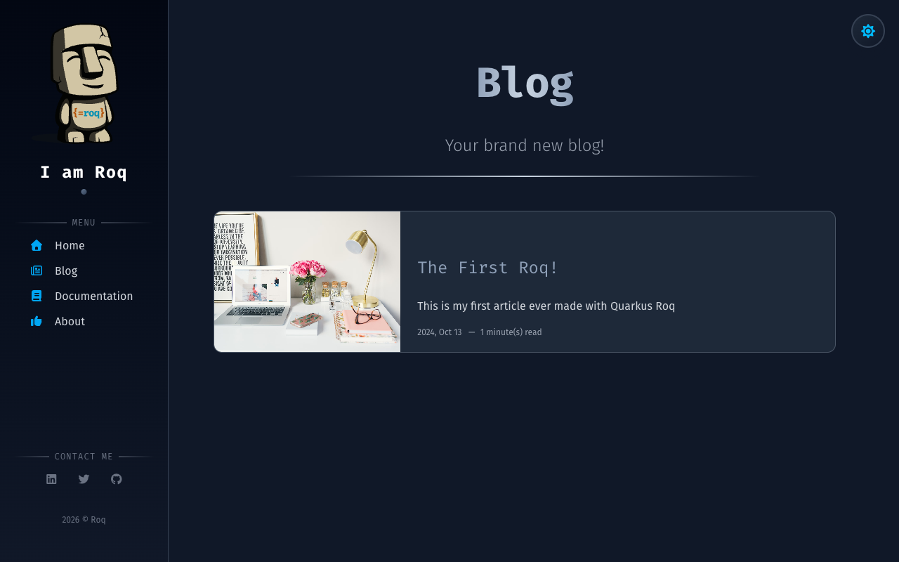
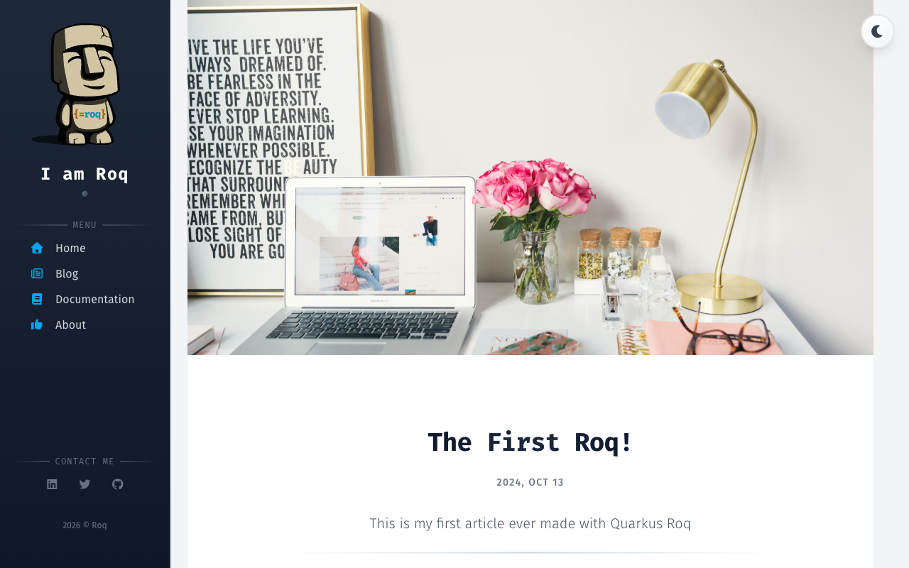
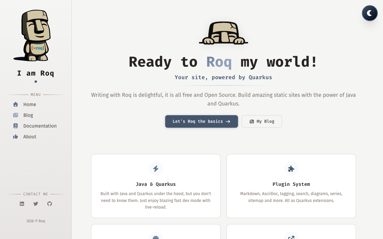
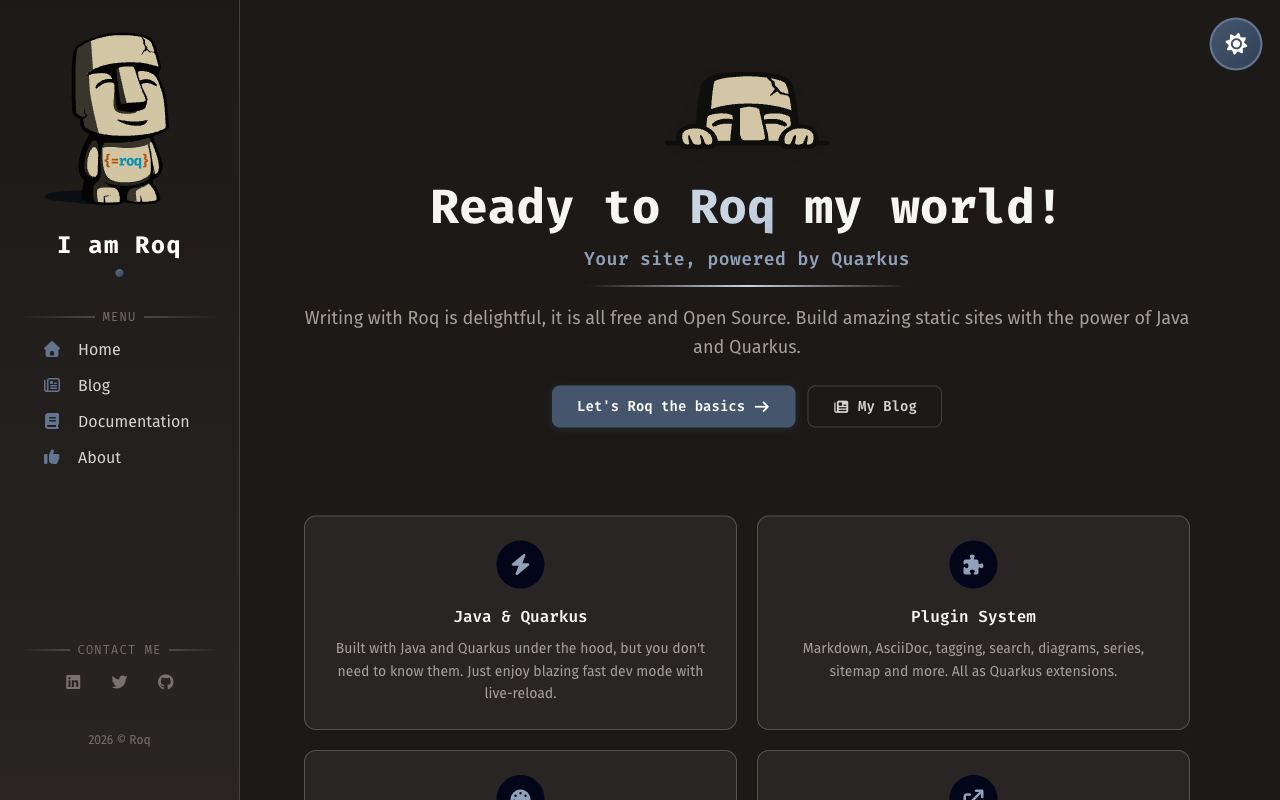
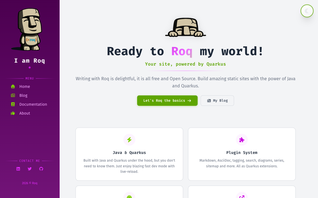
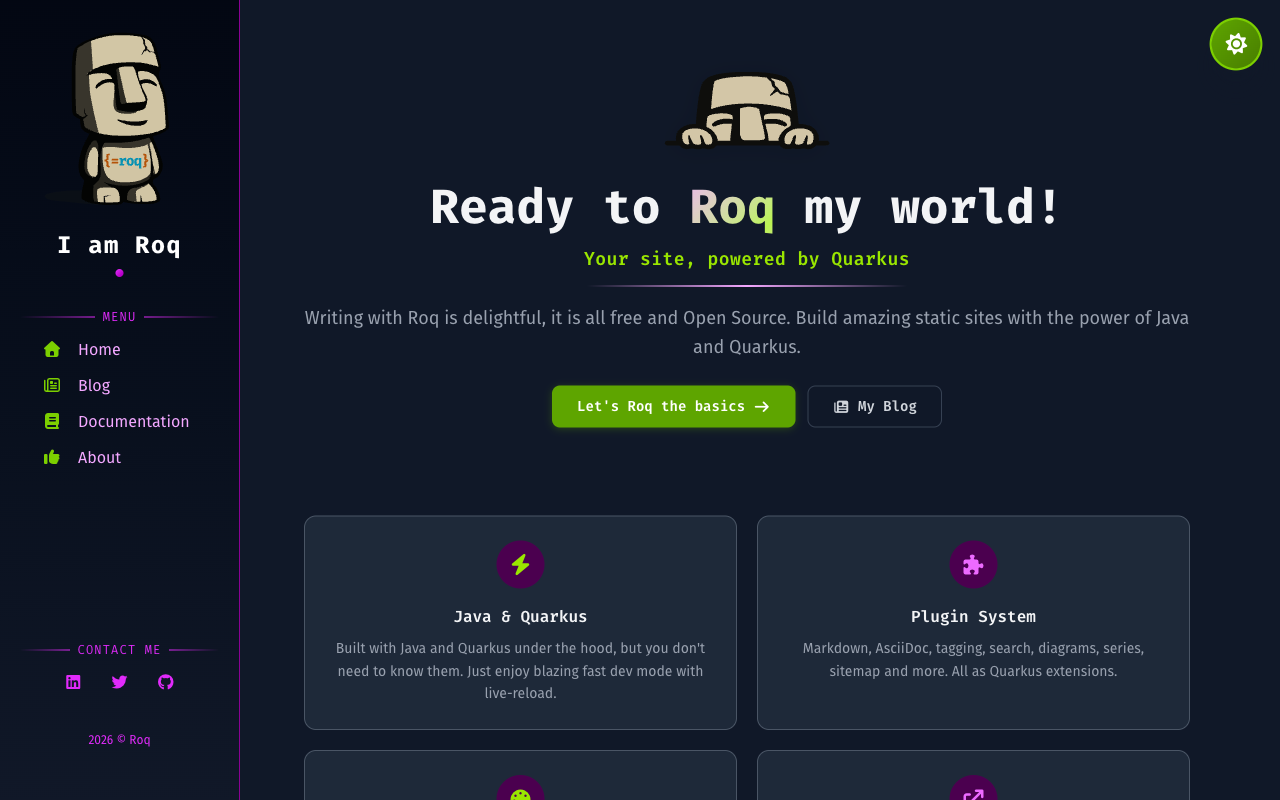
Screenshots
Install
Usage
The default Roq theme for blogs and sites (used on this site). Built with Tailwind CSS, featuring dark mode, responsive design, sidebar navigation, and social media links. The accent color palette can easily be customized with your own colors or any existing Tailwind color palette.
Site Data
Configure your site through the index page frontmatter (e.g. content/index.html):
| Key | Description |
|---|---|
name |
Site name displayed in the sidebar |
simple-name |
Short name used in the copyright notice |
logo |
Logo image path displayed in the sidebar (falls back to image) |
description |
Site tagline shown below the logo |
theme-color |
Color used for the browser address bar on mobile (default: #263959) |
Analytics
analytics:
  ga4: G-XXXXXXXXXX
Social Brands
Add social media links to your site through the index page frontmatter:
social-github: quarkiverse
social-twitter: quarkusio
social-linkedin: john-doe
social-mastodon: https://mastodon.social/@username
Available keys: social-twitter, social-github, social-linkedin, social-linkedin-company, social-facebook, social-youtube, social-discord, social-email, social-bluesky, social-mastodon, social-slack, social-whatsapp, social-instagram, social-telegram.
For Mastodon and Slack, you must provide the complete URL as these platforms don't have a standard prefix.
Menu
Define navigation menus in data/menu.yml. Each key becomes a menu section in the sidebar:
nav:
  - title: "Home"
    path: "/"
    icon: "fa-solid fa-house"
  - title: "Blog"
    path: "/blog"
    icon: "fa-regular fa-newspaper"
doc:
  - title: "Getting Started"
    path: "/docs/getting-started/"
    icon: "fa fa-bolt"
Each item supports title, path, icon (Font Awesome class), and optionally target (e.g. _blank for external links).
Authors
Define authors in data/authors.yml to display author info on blog posts:
ada:
  name: "Ada Lovelace"
  avatar: "https://example.com/ada.png"
  job: Software Pioneer
  profile: "https://x.com/ada"
  nickname: "ada"
  bio: "Passionate about algorithms and analytical engines."
Then reference an author in a post's frontmatter with author: ada.
Layouts
Theme layouts are automatically available: use layout: foo and it resolves local first, then falls back to the theme. To override a theme layout, create your own layout file and use theme-layout: foo to extend from the original.
default                 // Base HTML structure
├── main                // Shared site layout (sidebar, nav, footer)
│   ├── home            // Home page
│   ├── blog            // Blog listing with pagination
│   ├── page            // Generic page
│   ├── post            // Blog post with author and tags
│   └── tag             // Tag archive page
└── 404                 // Error page
Page Data
Frontmatter keys available to control page behavior per layout.
All layouts
| Key | Description | Default |
|---|---|---|
body-class |
Custom CSS class on the body element | |
page-class |
CSS class for page-specific styling | |
robots |
Value rendered as <meta name="robots"> via the built-in {#seo /} tag. Use noindex to keep drafts/internal/staging pages out of search engines. |
Page / Post
| Key | Description | Default |
|---|---|---|
show-header |
Show the page header | true |
show-header-date |
Show the date in the header | true |
show-header-intro |
Show the description in the header | true |
post-date-style |
Date format style: short, medium, long, or full (uses Java's FormatStyle, locale-aware) |
medium |
content-toc |
Enable table of contents | false |
content-toc-title |
TOC section title | Contents |
content-toc-levels |
Heading levels to include in TOC | 2 |
Post
| Key | Description | Default |
|---|---|---|
author |
Author key from data/authors.yml |
|
tags |
List of tags for the post | |
fig-caption |
Caption for the post cover image |
Blog
| Key | Description | Default |
|---|---|---|
featured |
Number of featured posts |
Partials
Override any theme partial by creating a file with the same name in templates/partials/roq-default/:
partials/roq-default/
├── 404.html
├── head.html
├── head-scripts.html
├── page-header.html
├── page-toc.html
├── pagination.html
├── sidebar-about.html
├── sidebar-contact.html
├── sidebar-copyright.html
├── sidebar-darkmode.html
└── sidebar-menu.html
Qute User-Tags
The theme provides reusable Qute user-tags for building pages:
roq/hero
Hero section for the home page.
{#roq/hero logo="roq-logo.svg"}
  {#title}My Site{/title}
  {#tagline}A tagline for my site{/tagline}
  {#subtitle}Some extra info{/subtitle}
{/roq/hero}
roq/featureCard
Feature card, typically used on the home page.
{#roq/featureCard icon="fa-solid fa-bolt" title="Fast" link="/docs/" link-text="Learn more" highlighted=true}
  Feature description here.
{/roq/featureCard}
roq/postCard
Blog post preview card. Used in blog and tag layouts, can also be used in custom pages.
{#roq/postCard post=myPost /}
roq/authorCard
Author profile card.
{#roq/authorCard name="Ada Lovelace" avatar="ada.png" profile="https://example.com" nickname="ada"}
  Author bio here.
{/roq/authorCard}
roq/terminal
Terminal emulator component for displaying commands.
{#roq/terminal title="Getting Started"}
  {#commands}
    {#command}
      {#prompt}${/prompt}
      {#cmd}quarkus{/cmd}
      {#args}create app my-site -x roq{/args}
    {/command}
  {/commands}
{/roq/terminal}
CSS Customization
Create a web/_custom.css file in your site to override theme styles. This file is processed by Tailwind, so you can use Tailwind utilities, @apply, @theme, and other Tailwind features. Other CSS files added to web/ are bundled as plain CSS without Tailwind processing.
Color Palettes
The theme is built on three color palettes. Override any combination to completely transform the look and feel of your site:
| Palette | Role | Default |
|---|---|---|
accent |
Structure: headings, links, page headers, sidebar | slate |
pop |
Energy: buttons, hover effects, gradients, icons | sky |
neutral |
Text and backgrounds: body text, cards, sidebar background | gray |
To swap a palette, map all 11 shades (50 through 950) in a @theme block in your web/_custom.css. You can use any Tailwind color or custom hex values:
@theme {
    /* Accent: indigo instead of slate */
    --color-accent-50: var(--color-indigo-50);
    --color-accent-100: var(--color-indigo-100);
    --color-accent-200: var(--color-indigo-200);
    --color-accent-300: var(--color-indigo-300);
    --color-accent-400: var(--color-indigo-400);
    --color-accent-500: var(--color-indigo-500);
    --color-accent-600: var(--color-indigo-600);
    --color-accent-700: var(--color-indigo-700);
    --color-accent-800: var(--color-indigo-800);
    --color-accent-900: var(--color-indigo-900);
    --color-accent-950: var(--color-indigo-950);

    /* Pop: rose instead of sky */
    --color-pop-50: var(--color-rose-50);
    --color-pop-100: var(--color-rose-100);
    --color-pop-200: var(--color-rose-200);
    --color-pop-300: var(--color-rose-300);
    --color-pop-400: var(--color-rose-400);
    --color-pop-500: var(--color-rose-500);
    --color-pop-600: var(--color-rose-600);
    --color-pop-700: var(--color-rose-700);
    --color-pop-800: var(--color-rose-800);
    --color-pop-900: var(--color-rose-900);
    --color-pop-950: var(--color-rose-950);

    /* Neutral: stone instead of gray */
    --color-neutral-50: var(--color-stone-50);
    --color-neutral-100: var(--color-stone-100);
    --color-neutral-200: var(--color-stone-200);
    --color-neutral-300: var(--color-stone-300);
    --color-neutral-400: var(--color-stone-400);
    --color-neutral-500: var(--color-stone-500);
    --color-neutral-600: var(--color-stone-600);
    --color-neutral-700: var(--color-stone-700);
    --color-neutral-800: var(--color-stone-800);
    --color-neutral-900: var(--color-stone-900);
    --color-neutral-950: var(--color-stone-950);
}
Changing all three palettes gives your site a completely different identity while keeping the same layout and structure. You can also override just one or two palettes. The Roq blog itself uses a custom cyan for accent and orange for pop.
Sidebar
The sidebar is fully customizable through theme variables in web/_custom.css. Color variables are defined in @theme and can be used as Tailwind utilities (e.g. text-sidebar, bg-sidebar-subtle):
| Variable | Role | Default | Utility |
|---|---|---|---|
--color-sidebar |
Main text color | neutral-300 |
text-sidebar |
--color-sidebar-heading |
Site name, headings | white |
text-sidebar-heading |
--color-sidebar-muted |
Secondary text, separators | neutral-500 |
text-sidebar-muted |
--color-sidebar-subtle |
Subtle borders, hover backgrounds | rgba(255,255,255,0.06) |
border-sidebar-subtle |
--color-sidebar-border |
Sidebar right border | neutral-700 |
border-sidebar-border |
--sidebar-bg |
Background (supports gradients) | neutral 800→900 gradient |
By default the sidebar is dark in both modes. To create a light sidebar in light mode with a dark sidebar in dark mode:
@theme {
    --color-sidebar: var(--color-indigo-800);
    --color-sidebar-heading: var(--color-indigo-950);
    --color-sidebar-muted: var(--color-indigo-500);
    --color-sidebar-subtle: rgba(0, 0, 0, 0.08);
    --color-sidebar-border: var(--color-indigo-200);
    --sidebar-bg: linear-gradient(180deg, var(--color-indigo-50) 0%, var(--color-indigo-100) 100%);
}

.dark {
    --color-sidebar: var(--color-indigo-200);
    --color-sidebar-heading: white;
    --color-sidebar-muted: var(--color-indigo-400);
    --color-sidebar-subtle: rgba(255, 255, 255, 0.06);
    --color-sidebar-border: var(--color-indigo-800);
    --sidebar-bg: linear-gradient(180deg, var(--color-indigo-950) 0%, var(--color-indigo-900) 100%);
}
For best dark mode legibility with colored sidebars, test your chosen palette carefully. Alternatively, omit the
.darkblock to fall back to the default dark sidebar.
Dark Mode
Dark mode is built-in with automatic system preference detection and a toggle in the sidebar. No configuration needed.
SEO
The theme includes built-in SEO support with meta tags, Open Graph, Twitter cards, favicon auto-discovery, and RSS. For more details, see the SEO, Favicon, Analytics, and RSS documentation.